Description

We are Cambridge Energy Data Lab, a smart energy startup based in Cambridge, UK.
This blog, named "Cambridge Energy Data Analysis", aims to incrementally unveil our big data analysis and technologies to the world. We are a group of young geeks: computer scientists, data scientists, and serial entrepreneurs, having a passion for smart energy and sustainable world.

Friday, 22 August 2014

Some insights about domestic electricity prices in the IEA countires

In this post we will provide three interactive visualizations of the latest data released by the International Energy Agency (IEA) about the domestic electricity prices*.

Prices in 2013

In the first figure below we compare the prices of the domestic electricity among the countries monitored by IEA. The plot also shows which fraction of the price is represented by taxes:

In 2013, average domestic electricity prices, including taxes, in Denmark and Germany were the highest in the IEA. We also note that in Denmark the fraction of taxes paid is higher than the actual electricity price whereas in Germany the actual electricity price and the taxes are almost the same. Interestingly, USA has the lowest price and the lowest taxation.

Relationship between taxes and full prices

In this figure we highlight the correlation between taxes and full prices: Here we can see that there is a positive correlation (correlation=0.82) between the prices with taxes and the prices without taxes. This indicates that according to this data, when the full price increases, the taxes also increase. Hovering the pointer on the points we can discover that Germany and Denmark have the highest taxes, while USA, UK and Japan have the lowest. Also, we note that Ireland has expensive electricity and low taxes, while Norway shows the reverse trend.

Evolution of the prices from 2010 to 2013

Here we try to compare the trend of the prices among the five countries with the higest prices in 2013: From this chart we can observe that only in 2013 the cost of the electricity for the domestic consumers has become very similar in Germany and Denmark and that the Danish prices were substantially higher in the past. We can also see that prices in Italy and Ireland have a very similar increasing trend while prices in Austria dropped in 2012 but raised again in 2013.

*the prices are showed as pence per Kwh.

A weather forecast accuracy study

Can you trust the weather forecast ?


It's a question that can trigger long passionate conversations, especially in this country (UK) where talking about the weather is deeply embedded in the culture. An answer to such a question can therefore be of interest to anybody living in the UK, but also for companies like us who work constantly with weather forecast data in order to produce accurate estimation of renewable energy production. This study will focus on the daily-averaged solar radiation over the Tokyo area from November 2013 to July 2014.

First, we plot in figure 1 the actual solar radiation in kWh over the Tokyo area.

Figure 1: Actual solar radiation over the Tokyo area from November 2013 to June 2014. It's getting hot! The first and third quartile range shows the geographic variability over the area. We observe that the solar radiation is homogeneous over Tokyo.

We can access weather forecasts for the day ahead, the following day or even a week or a month in advance. The number of days separating the date of the prediction and the date the prediction was done for is called the forecast horizon (abbreviated fh in the following). Our dataset consists of 31 different forecasts for every day, from a forecast horizon of 1 to 31. Short term forecasts (0 < fh ≤ 11) are created by weather models. These models take weather data from the past and use it to predict the future of the weather conditions (temperature, pressure, wind, humidity…). Long term forecasts (11 < fh ≤ 31) are determined from considering previous years’ averages. For all these forecasts, we can compute the error by comparing the forecast solar radiation value to the actual value. We represent in figure 2 the error distribution for both long term and short term forecasts.

Figure 2: Error distribution for long and short term forecasts. We notice that the long term distribution is biased towards the negative values (under-estimation) while the short term is slightly biased towards the positive values (over-estimation). The short term distribution shows more of an even distribution around zero, indicating that this forecast is more accurate than the long term one... but not by much!

This figure shows us that the short term forecast performs better than the long term forecast. Now we can question how this error varries with the forecast horizon. We therefore plot in figure 3 the MAPE (measure of the accuracy) and MPE (measure of the bias) as a function of the forecast horizon.

Figure 3: MAPE (measure of the accuracy) and MPE (measure of the bias) as a function of the forecast horizon. The error and the confidence interval decrease as the forecast horizon approaches 0.

We note that the forecast accuracy is improving (the error is decreasing) when the forecast horizon gets closer to 0, for which we have a vanishing error since it corresponds to actual weather values. Not only does the accuracy gets better, but so does the confidence interval (the shaded regions are narrower for short term forecasts). We also confirm that the solar radiation is under-estimated by the long term forecast and slightly over-estimated by the short term one (see right-hand-side plot). This could be due to the fact that the studied period is particularly sunny compared to previous years. However, we also notice that a 10-day weather model forecast is, on average, worse than a prediction based on previous years’ averages... We know since Lorenz that chaotic systems (weather models are good examples of chaotic equations) are very sensitive to initial conditions... Therefore, a middle term forecast based on a weather model has to be considered with caution.

So please, keep chatting about the weather but when it comes to planning a barbecue a week in advance, don't put all your trust in the forecast!

Tuesday, 1 July 2014

Data-Driven Summary of the Current State of the UK Energy Market

Data-Driven Summary of the Current State of the UK Energy Market

In March 2014, Ofgem released a comprehensive report on the state of competition in the energy markets in the UK.1 This report provides an in-depth analysis of how the competition amongst the Big Six and small firms has been functioning. This article aims to show several crucial stats/graphs from the report and provide the summary.


1.Tacit Coordination

The first chart below shows how the households’ average dual fuel bills has changed between 2004 and 2014. The second chart shows the pattern of averaged price announcements over the same period. The red/white circles indicate price increases/decreases. The size of the circle is proportionate to the size of the announced average price increase. Both charts imply “tacit coordination” made by Big 6.


From these charts above, average dual fuel prices increased by 24 per cent between 2009 and 2013. Also, the analysis conducted by Ofgem shows that between 2009 and 2012 unit revenues in the supply of energy by the Big 6 increased by 16.9% while unit total costs increased by 13%. Even with the increased environmental taxes imposed from the beginning of 2013, it have been also observed that there is an increase in the aggregate reported profits of the Big 6 over the last four years from £233 million in 2009 to £1.1 billion in 2012. Although further research would be required, no clear evidence has been found showing suppliers have become more efficient in reducing their own costs.

Price announcements appear to take place in identifiable rounds. Of the 16 price rounds, 12 were associated with price increases while four were associated with price decreases. The Big 6 announced their price changes at almost the same time with nearly the same size of price adjustment. Thus, prices appear to be strongly correlated over the period. Ofgem found that the correlation between firms’ price changes and price changes of competitors that preceded the firm during the period of price announcements are high – 0.93 for gas and 0.84 for electricity.


2. Weak Competition

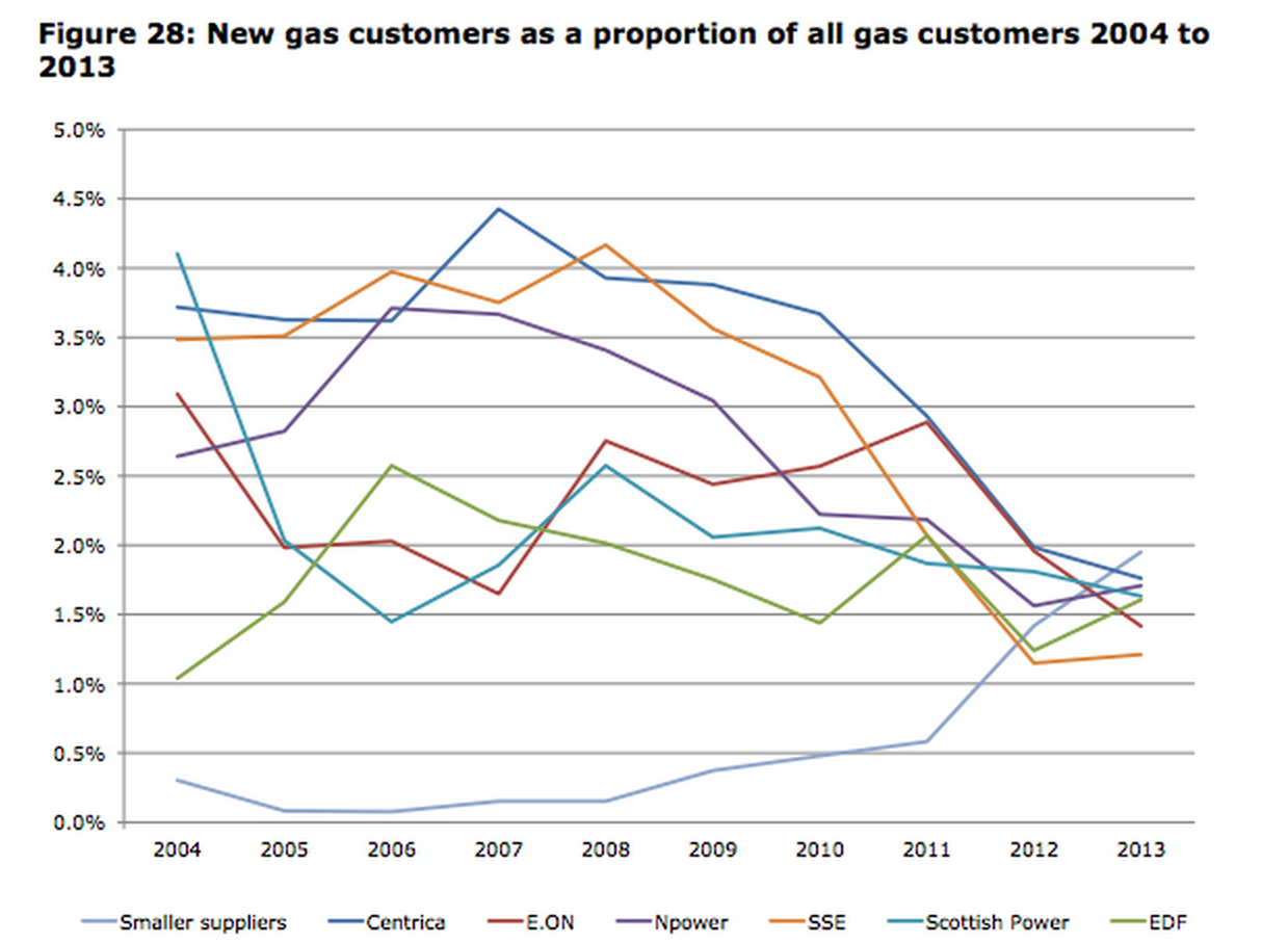
Next, the intensity of energy market competition is analysed. There is strong evidence that suggests that big firms are not fighting hard to win new customers, which is shown in its switching statistics below.

Source: DNO information request
Note: in this figure, switching is defined as the number of customers of the six largest electricity suppliers' customers who have switched to that supplier in that year, as percentage of all electricity customers.


Both electricity and gas switching rates of the Big 6 have decreased to slightly above 1% for the last 5 years. In contrast, the small suppliers have had steady growth in the number of new customers. This implies that the Big 6 are not competing harder than before to get customers from each other as compared to small suppliers.

Switching rates could be low if most customers are happy with their suppliers, but the other evidence suggests that this is not the case. The two bar charts below show how well consumers trust in suppliers and why they do not switch suppliers.

Source: Ipsos MORI, Customer Engagement with the Electricity Market Survey 2013, p. 52 
Source: Ipsos MORI, Customer Engagement with the Electricity Market Survey 2013, p. 22


The figures show that majority of suppliers do not tend to trust suppliers. Slightly above 50% of consumers are happy with their current suppliers and for the rest of them switching suppliers is a hassle.

Other evidence of weak competition is shown in the figure below. This figure shows the annual rates of switching suppliers, tariff or payment method. The number of consumers who switched gas or electricity suppliers has been decreasing from nearly 20% to slightly above 10% while number of those who switched just tariff or payment method with the same suppliers has been rising steadily up to 20%. This means that consumers tend to move to a better deal with the same suppliers rather than switching to the different suppliers.

Source: Ipsos MORI, Customer Engagement in the Energy Market, Tracking Survey 2013, pp. 10-16


3. Growing small suppliers

The total market share of new entrants have been increasing steadily up to 5% and is predicted to continue to rise. Since the energy market liberalization in 1998, there have been 24 entries to the energy retail market and 18 companies are still in business currently (May 2014). The graph below shows the new entries and exits to the energy retail market from 1996.


The graph below is the domestic electricity supply market shares for the last ten years.The market share of the Big 6 has remained high at between 11 and 25 per cent over the period while the market share of the small suppliers has remained low. However, there has been a sharp growth of smaller suppliers, and their market share passed over 5 per cent at January 2014. (This includes the acquisition by Utility Warehouse which was previously Telecom Plus, of 770,000 customer accounts from Npower.)

Source: Meter Point Administration Number (MPAN) data from Distribution Network Operators (DNOs)


4. Conclusion

Ofgem highlights 5 major recurring problems below which limit entry and restrict expansion for small suppliers: 1.Low liquidity in the wholesale market, 2.Credit and collateral requirements, 3.Difficulties in persuading some customers to switch, 4.Regulatory barriers to expansion, 5.Limits to available interconnection capacity

Despite these barriers, evidence suggess that it is still possible to enter the markets and compete with the Big 6, and that many small suppliers are doing so.


5. Acknowledgement
This article is originally written by Taiki Asakawa, an intern student. Throughout his master's dissertation is in UK electricity market reberalisation, he brought us meaningful insights of the electricity market situation and issues. Let me thank him again for his dedicated contribution.

References

  1. State of the Market Assessment

Monday, 19 May 2014

How Do You Use Electricity ?

Collecting data with smart-meters

Smart-meters, through their ability to communicate data instantly, are re-shaping the electricity market landscape. Indeed, these new-generation meters collect and transmit instantaneous electricity consumption data, which can then be used by various actors ranging from the user (e.g. to monitor its own usage) to the supplier (e.g. to forecast energy demand) via independent companies (like Cambridge Energy Data Lab) which help make more sense of this data.

In this short study, we will focus on identifying generic behaviours of electricity consumption within a dataset of more than 400 users for the February-March 2014 period. Because the raw dataset is impossible to interpret, we will perform what is usually referred to as a "model reduction."


Principal component analysis

The first step in the analysis is to perform a model reduction to define several types of days. Amongst all the unique day time-series, we select few thousands (8000 days exactly, out of the 60 days x 400 users = 24000 total days available) in order to perform a Principal Component Analysis.  PCA is a linear algebra method used in order to find directions of largest variance in a dataset composed of several samples of a given variable. See figure 1 for a visual example.

Figure 1: PCA, 2-dimensional example. PCA finds the orthogonal directions which maximise the variance of the samples. 
After having performed a PCA, we can order the different samples along the first principal component (PC1 in Figure 1). We perform a PCA on the dataset composed of the 8000 different days of electricity consumption and order the different days along the first principal component. The result is presented in Figure 2.

Figure 2: PCA performed on a dataset of 8000 days of electricity consumption. The days are ordered with respect to their coordinate along the first principal component.
We notice that the days are now ordered with respect to a relevant criterion since we can detect a continuous evolution from users consuming electricity during the day and in the evening (top of Figure 2) to users who mostly use electricity in the evening and at night (bottom of Figure 2). From this observation, we can therefore define different types of days.
We then simplified the full dataset thanks to this criterion, creating around 10 different "types of days." It is therefore possible to simplify the 2-month time-series by attributing a value to each day corresponding to its type. This is represented in the left panel of Figure 3.

Figure 3: Left panel: unordered "type of day" time-series. Right panel: ordered "type of day" time-series obtained by ordering along the first principal component. We notice an evolution from users who mostly use electricity during the day (top) to users who mostly use electricity at night (bottom).
By re-applying the concept of first principal component ordering, we can re-order the simplified "type of day" time-series. This is presented in the right hand side panel of Figure 3. This time, more than ordering the time-series of the days, we manage to order the users. Each separate user can therefore be attributed to a category, depending not only on the type of daily consumption, but also on the longer time-scale (weekly, monthly) behaviour. Indeed, at the top of the right side panel are represented the "type of day" time-series for the users consuming electricity mostly during the day and the evenings, whereas the bottom part of this colour plot is associated with users consuming electricity mostly at night time. We can also notice on this figure a longer time-scale behaviour ordering, and the signature of the week-ends where people tend to stay awake (and use more energy) later at night.


Conclusion

The large amount of data collected by smart-meters can only been visualised and interpreted by using advanced mathematical tools, PCA being one of them. This method allowed us to successfully define different types of days in terms of electricity usage and therefore simplify the complete users' electricity time-series. From this model reduction, another PCA was then performed to directly order the users, therefore gaining insight about the different types of electricity consumption behaviour present in the dataset.

Thursday, 3 April 2014

Smart Houses with Batteries and Renewable Generation

Concept

The preferred method of electricity consumption in the UK is to buy electricity from the grid - through a contract with an electricity retailer - and use it for daily needs such as lighting, heating, cooling, cooking, etc. However, several alternatives to this simple unilateral flow of energy from the grid to devices exist. We will focus on two other types of energy consumption behaviour, enabled by both domestic energy storage and production.

Energy storage consists of storing electricity under an alternative form (potential, chemical, thermal, mechanical, etc.) and, when needed, converting it back to electrical energy. Electricity storage has begun to be applied to houses and buildings, and it shows potential to both reduce customers' energy bills and help bridge the gap between energy demand and supply. Electricity is usually more expensive at peak times, and, generally, is cheaper at night than during the day. Therefore, using batteries to store electricity at night and re-use it during the day can be profitable.

Domestic energy production relies on harvesting energy from natural sources (such as wind, solar radiation, etc.) and using this stream of energy along with energy coming from the grid to meet a home's demands. The UK has installed solar panels on half a million houses so far, and plans to extend this to 10 million by 2020 [1]. With such equipment, households are not only able to produce a portion of the energy they use, but can also directly sell the energy they produce back to the grid through feed-in tariffs.

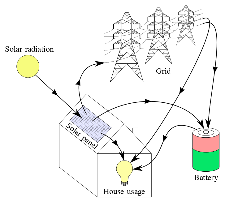
These two approaches to energy distribution, domestic production and usage can even be combined to create smart houses (see Figure 1), which are powered by incoming electricity from the grid, battery discharge and renewable energy. We can observe that widespread implementation of such strategies smoothes the electricity peak demand, allowing energy producers to more accurately predict the overall needs of the grid.


Figure 1: Schematic of a house equipped with both a solar panel and a battery.


Proof of concept

At Cambridge Energy Data Lab, we prefer crunching actual data to help us make real energy predictions. Therefore, we analysed the electricity consumption of approximately 500 houses, all equipped with lithium-ion batteries, and approximately 40% also equipped with solar panels.

We first focused on the group of houses equipped with batteries only and analysed their daily energy usage. The aggregated (averaged over all the users, for the winter period) results are displayed in Figure 2.

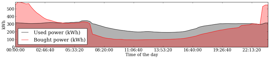
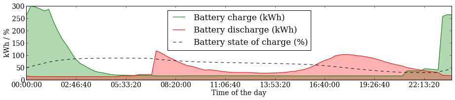
Figure 2: Averaged daily electricity usage for accommodations equipped with battery but no solar panel.


We can clearly see that a sizeable fraction of the energy required during the day (when the electricity rates are expensive) is shifted to the night through the charging of the battery. This stored energy is then released during the day. When electricity becomes cheaper later in the evening, the battery starts to charge anew.

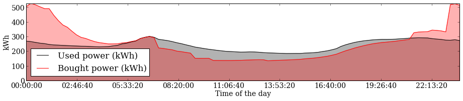
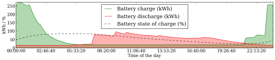
The same analysis can be carried out for the group of users with solar energy generation. The results are presented in Figure 3.

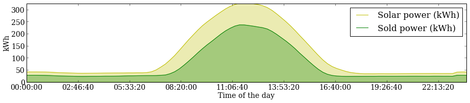
Figure 3: Averaged daily electricity usage for houses equipped with battery and solar panels.


The same observations are made for this group of users: the daytime energy demand is partly moved to nighttime. Moreover, during the day, solar power is produced and allows for less intensive usage of the battery. When a surplus of energy is present, it is sold to the grid and generates income.

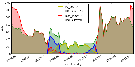
When looking at the data for a single day (see Figure 4), we realise that the combination of both solar power generation and energy storage with a battery is very effective at minimising electricity purchase from the grid, especially during the day when it is the most expensive.


Figure 4: Single day analysis: the energy bought from the grid is minimised during the day.


Conclusion and further analysis

This preliminary analysis shows the potential of individual electricity generation and storage. The electricity usage in a house can be distributed along different streams and optimised to reduce the overall cost for the customer. But these installations are very costly too. How long would it take you to reimburse such an investment? We plan to analyse this in the future, so stay tuned!


[1] http://www.theguardian.com/environment/2014/jan/29/uk-10-million-homes-solar-panels-2020

Wednesday, 2 April 2014

Energy Surplus Trends from Domestic UK Solar Panels in October 2013 to January 2014

According to the statistics provided by the Department of Energy and Climate Change, around 1,900 solar schemes, Feed-In-Tariff (FiT) for solar panels installation, have been installed every week during the past year in the UK. By 5 January, about half million solar schemes had been installed in total.1,2 The solar energy revolution has started, but how much energy can actually be produced using solar panels?

At our lab, we analyzed the energy surplus produced from 1 October 2013 to 31 January 2014, and here we report some basic statistics about this selection of customers.


In these 4 months, our customers had an average energy surplus of approximately 827 kWh, which is similar to the average monthly energy consumption of an American house.3 The lowest surplus obtained by a customer was approximately 340 kWh, while the highest was approximately 1483 kWh.


We recorded the highest peaks of the energy surplus between November and December, although two others significant peaks were recorded in the first half of October and at the beginning of January.

References

  1. Solar panels on half a million UK buildings, figures suggest, Jessica Shankleman for BusinessGreen, part of the Guardian Environment Network theguardian.com
  2. Weekly solar PV installation and capacity based on registration date
  3. U.S. Energy Information Administration website

Monday, 31 March 2014

From energy consumption data to energy profiles

We are all using electricity, non-stop, 24 hours a day. Electricity is our constant companion, but hardly anyone thinks about electricity when we turn on a light or watch the news on TV. Our utility bill is only some abstract amount of electricity we used over a long period of time, so we pay and forget about it.
At Cambridge Energy Data Lab, we think there is much more value in the details of how you use electricity. We believe that if you know and understand your own electricity usage better, you can save money and energy. Our aim is to create insights from your day-to-day electricity consumption to find the best price plan for you, and to convey this knowledge to help you adjust your habits and take control of your electricity usage.

Electricity consumption is not necessarily very regular and depends on many different factors. This is the electricity consumption of a household over a period of days:
The raw energy usage of an exemplary household.  

We can see immediately how the energy usage of this household is extremely irregular, so will have to do some further data analysis to provide the insights we are aiming for. Let's try to create an aggregated energy profile for this household. Using time-series analysis, we first decompose the original data into a periodic day-to-day component, a trend component, and a remainder which cannot be explained by the periodic and trend component:

The decomposition of the raw electricity usage data of a particularly low-usage household. The first panel shows the original data set which we decompose into 3 separate components: a periodic day-to-day element (called seasonal in timeseries analysis), the trend component indicating a smooth overall trend, and the remainder which is the partial data which cannot be explained by the other components.
This decomposition based on a daily interval is just the first step. Let's look at the periodic day-to-day component and decompose it a second time on an hourly frequency interval:

The second decomposition of the periodic component from the previous decomposition. We now have an periodic element with a hourly frequency. The remainder has been omitted. 

From the seemingly irregular raw data, we arrive at an aggregated energy profile which shows a clear trend of high electricity usage between the morning and evening hours. We can also see the periodic element of appliances, such as a refrigerator, in the seasonal component. This is just the first step, however, and much more sophisticated analysis is still to come. Nevertheless, it demonstrates that even your day-to-day electricity usage, though it doesn't look like much, is full of valuable insights.

Our goal is to develop methods and tools to make your electricity consumption data accessible to you!